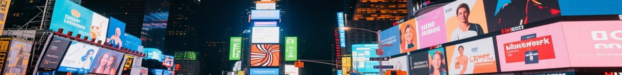
Text on an LED wall should be easy. Type it, send it, done. But if you have ever watched a message crawl across a display with jagged edges, flickering characters, or colors that shift mid-sentence, you know it is not that simple. Text playback on LED displays requires specific settings that most people skip entirely. The result is content that looks unprofessional, even when the hardware is perfectly fine.
This guide covers how to configure text playback on an LED display from scratch. It walks through font rendering, scrolling speed, color management, and the common mistakes that turn a clean message into an eyesore.
The first thing to understand: the problem is almost never the font you chose. It is how the display renders that font at the pixel level. LED panels do not have the smooth anti-aliasing that a monitor or laptop screen provides. Each character is built from a grid of physical LEDs. If the text resolution does not align with the pixel grid, you get stair-step edges. If the color depth is too low, you get banding inside the character strokes. If the refresh rate is wrong, the text flickers as it scrolls.
A 10-point Arial font that looks crisp on a laptop can look like a blocky mess on a P4 outdoor display. That is not a font problem. That is a configuration problem.
Every LED display has a fixed pixel pitch — the distance between LED centers. Your text must be rendered at a resolution that maps cleanly to that grid. If your display is 1920 pixels wide and you send a 1080p text layer, the scaling engine has to interpolate. That interpolation creates blur and artifacts, especially on diagonal strokes and curved letters like "S" or "O."
The fix is simple: render your text at the native resolution of the LED wall. If the wall is 3840 pixels wide, create your text assets at 3840 pixels wide. Do not scale up from a smaller resolution. Ever. This one change eliminates most of the jagged-edge problems people blame on cheap fonts.
Scrolling text is the most common use case for LED message boards, and also the one where people make the most mistakes.
Too fast and nobody can read it. Too slow and it looks lazy. The rule of thumb for scrolling text is roughly 3 to 5 characters per second for indoor displays and 5 to 8 characters per second for outdoor displays where viewers are farther away.
But speed alone is not enough. You also need to set the scroll direction and the pause timing. A message that scrolls continuously without a pause feels frantic. Adding a 3 to 5 second pause between each scroll gives the viewer time to absorb the content. Most LED control software lets you set scroll speed, direction (left to right, right to left, top to bottom), and pause duration independently. Use all three.
When your message is longer than one line, do not let the software auto-wrap. Auto-wrapping on LED displays almost always breaks words in the wrong place or creates orphaned single letters on the next line. Manually set your line breaks. Decide exactly where each line ends before you send the content to the display.
Also, match the line spacing to your pixel pitch. On a tight-pitch indoor wall (P2 or below), you can get away with tight line spacing. On a large-pitch outdoor wall (P8 or above), increase the gap between lines. If the lines are too close on a large pitch, the descenders from one line (the tail of a "g" or "y") crash into the ascenders of the next line (the top of an "h" or "l") and the text becomes unreadable.
Text color on an LED display is not just a style choice. It is a visibility engineering problem.
White text on a black background is the safest combination. It works at every viewing distance, in every lighting condition, and on every pixel pitch. If you deviate from this — red text on a blue background, yellow on green, light gray on white — you are gambling with readability.
The problem with colored text is that LED displays render color through RGB mixing. At low brightness levels, the color balance shifts. Your carefully chosen "brand blue" text can turn purple or teal when the display dims for nighttime operation. Always test your text colors at both full brightness and reduced brightness. If the color shifts noticeably, pick a different one.
A common mistake is setting text and background at the same brightness level. If your background is a full-white image and your text is also white, the text vanishes. The text needs to be at a different luminance than the background — either significantly brighter or significantly darker.
For nighttime operation, most displays drop to 20 to 30 percent brightness. At that level, fine text strokes can disappear entirely because the LEDs are not emitting enough light to resolve thin lines. If you run a message board at night, use bold fonts and avoid thin serif typefaces. Sans-serif fonts with thick strokes hold up better at low brightness.
Video editing software is designed for moving images, not static text. When you export text from a video editor, it gets rasterized into a video frame — usually 8-bit, 30fps or 60fps. That means your text is now a video, not a text layer. You lose the ability to change the content without re-exporting, and you waste bandwidth sending full video frames for something that could be a simple data packet.
Use dedicated LED text playback software instead. These tools send text as vector-like data or high-resolution still frames. They let you edit the message in real time, change colors on the fly, and schedule multiple messages without re-rendering anything. The bandwidth savings are significant, especially on large walls where every megabit per second matters.

Name: Jerry
Mobile:+8615915361141
Tel:86-0755-82599892
Whatsapp:8615818291783
Email:info@conwinled.com
Add:Room 313-315, Building A, Sanlian Industrial Zone, Shiyan Street ,Shenzhen, China